CHEZ SCHNABEL – SCREENPRINTING ON CRYLUXE
A whole series of actors must be involved if an unusual masterpiece is to be presented in such an unusual form.
Illustrator and comic artist Anna Haifisch and the DZA Druckerei zu Altenburg have created such a masterpiece with Chez Schnabel. It took a few binding tests before the final material selection with CRYLUXE was made, says Laura Nierth, customer service at DZA. An extra service that the “passionate book manufacturer” is happy to offer.
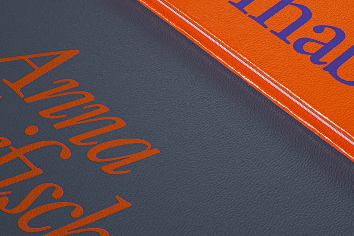
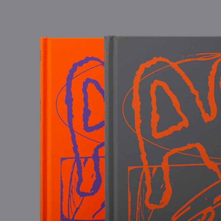
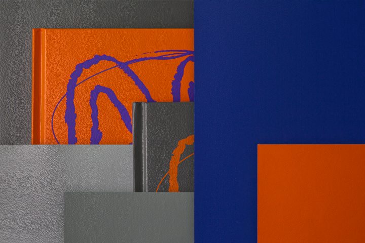
The book block was printed on the KBA Rapida RA 106. Five colours + coating with three special colours in Pantone Violet, Orange 21 and Pantone 102 U, as well as black. Exactly these selected Pantone special colours are reflected in the cover design. According to this, a colour change was integrated into the design concept when selecting the cover materials. CRYLUXE neon orange and platingrau were a perfect match in terms of colour, surface, haptic and durability. A single-colour motif in each case rounded off the overall design of the object. The cover with CRYLUXE platingrau was printed in orange and the cover with CRYLUXE neon orange was screen-printed in purple.
A whole series of actors must be involved if an unusual masterpiece is to be presented in such an unusual form.
Illustrator and comic artist Anna Haifisch and the DZA Druckerei zu Altenburg have created such a masterpiece with Chez Schnabel. It took a few binding tests before the final material selection with CRYLUXE was made, says Laura Nierth, customer service at DZA. An extra service that the “passionate book manufacturer” is happy to offer.
The book block was printed on the KBA Rapida RA 106. Five colours + coating with three special colours in Pantone Violet, Orange 21 and Pantone 102 U, as well as black. Exactly these selected Pantone special colours are reflected in the cover design. According to this, a colour change was integrated into the design concept when selecting the cover materials. CRYLUXE neon orange and platingrau were a perfect match in terms of colour, surface, haptic and durability. A single-colour motif in each case rounded off the overall design of the object. The cover with CRYLUXE platingrau was printed in orange and the cover with CRYLUXE neon orange was screen-printed in purple.
Not least because of the great expertise of all those involved, it was even possible to dispense with a press proof. After the machine and screen were set up, the customer gave her approval and the printing of the entire run began.
The text paper is produced with 80 g/sqm Salzer EOS 1.3 blauweiß. And Salzer paper with a slightly higher grammage was also used for endpapers. The further processing impresses with a classic thread-stitched hardcover.
Cover material: CRYLUXE 1028 neon orange and CRYLUXE 1032 platingrau